You've chosen your suit. The shirt is crisp. The tie is knotted to perfection. You look in the mirror and something's missing. That empty chest pocket is an opportunity. But it's also a risk. Add the wrong pocket square, and you go from polished to costume. Add the right one, and you announce, without a word, that you understand the details.
The relationship between a tie and a pocket square is a conversation. They should complement each other, not shout over one another. They should create a harmonious whole, not a chaotic clash. This is where many men hesitate. Should they match? Should they contrast? What about patterns? What about textures?
The good news is, there are classic rules that take the guesswork out of the equation. They're not rigid laws, but guiding principles. Once you understand them, you'll never stare blankly at your dresser again, wondering if that square works with that tie. You'll just know. Let's unlock the secrets of the perfect pocket square + tie pairing.
The Golden Rule: Complement, Don't Match
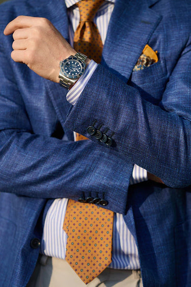
This is the most important principle in all of menswear. It's also the most frequently violated. The golden rule is simple: your pocket square should never match your tie exactly.
Think about it. When a pocket square perfectly matches a tie, it looks like it came in a pre-packaged set. It looks like you didn't put any thought into it. It lacks personality. It's the visual equivalent of a boring conversation.
Instead, your square should complement your tie. It should share a color, echo a texture, or harmonize with a pattern. The goal is a look that's coordinated but not forced, intentional but not stiff. This is the essence of classic pairing rules. A great pairing feels like it was meant to be, but not because someone put a barcode on it.
The Color Conversation: Your First Step
Color is where most pairings begin, and it's the easiest place to get it right. You have two main paths: contrast or complement.
1. Contrast: The Bold Choice
Contrast means choosing a square that sits opposite your tie on the color wheel, or at least offers a distinct difference.
- How it works: A navy tie with a white linen square. A burgundy tie with a cream square. A grey tie with a sky blue square.
- Why it works: The contrast creates a clean, sharp look. The square frames the tie without competing. This is a classic, foolproof approach. A white linen square is the ultimate contrast piece and belongs in every man's collection.
- Best for: Business settings, formal events, and anytime you want a crisp, authoritative look.
2. Complement: The Subtle Art
Complement means choosing a square that picks up a secondary color from your tie, or is a lighter or darker shade of the same color.
- How it works: A navy tie with a lighter blue square (maybe with a subtle pattern). A burgundy and gold striped tie with a burgundy square. A green tie with a square that has a hint of green in its pattern.
- Why it works: This creates a more nuanced, sophisticated look. It shows you've paid attention to the details. The square doesn't shout; it whispers.
- Best for: Weddings, date nights, and any time you want a softer, more romantic feel.
3. The Power of Neutrals
Never underestimate the power of a white, cream, or off-white square. They are the Swiss Army knife of pocket squares. A white linen square works with virtually any tie. It adds a touch of freshness and formality without any risk. It's the ultimate "can't go wrong" choice. This is a key part of any pocket square and tie color rules discussion.
The Pattern Play: Mixing with Confidence
Once you're comfortable with color, it's time to introduce pattern. This is where things get interesting, but it's also where mistakes happen. The key is to understand scale and contrast.
Mixing Patterns: The Scale Rule
When mixing a patterned tie with a patterned square, ensure the patterns are of different scales.
- Large + Small: A tie with a large, bold paisley pattern pairs beautifully with a square with a small, neat geometric pattern or a simple solid with a textured edge.
- Stripes + Dots: A pocket square patterns with striped tie is a classic combination. The key is to ensure the scale differs. A tie with narrow, closely set stripes works well with a square with larger, more spaced-out polka dots. Or vice versa.
- The Common Color: The safest way to mix patterns is to ensure they share at least one color. This creates a visual link that ties the whole outfit together.
The Solid Anchor
If you're unsure about mixing patterns, the safest and most classic approach is to pair a patterned tie with a solid square, or a solid tie with a patterned square. This creates a perfect balance. The pattern becomes the star, and the solid provides a quiet, supporting role. This is especially effective when choosing a pocket square for navy suit with a patterned tie.
The Texture Tale: Adding Depth
Texture is the secret weapon of advanced dressing. It's the detail that most men overlook, but it's what separates the well-dressed from the impeccably dressed. When your tie and pocket square share a textural relationship, the outfit gains depth and richness.
- Linen + Silk: A classic combination. The matte, crisp texture of a linen pocket square contrasts beautifully with the smooth, slightly shiny surface of a silk tie. This is a pairing that always works.
- Wool + Linen: Perfect for autumn and winter. A wool tie (or a silk-wool blend) paired with a linen square creates a wonderful, textural warmth.
- Knitted + Linen: A pocket square with knit tie is a match made in heaven. The relaxed, ribbed texture of the knit tie is perfectly complemented by the crisp, casual texture of a linen square. This is a fantastic smart-casual look.
- Silk + Silk: Pairing a silk tie with a silk square can work, but you need to be careful. If both are high-gloss, they can compete. A matte silk tie with a matte silk square in a contrasting or complementary color can be elegant. A silk square in a different weave (like a silk foulard) can also add subtle distinction.
At a Glance: A Simple Pairing Cheat Sheet
Here's a quick reference to help you make confident choices, whether you're asking should pocket square match tie or exploring contrast vs match pocket square.
|
Tie |
Pocket Square |
Why It Works |
|
Solid Navy Silk |
White Linen (Presidential fold) |
Ultimate contrast. Crisp, clean, foolproof for business. |
|
Burgundy/Gold Striped Silk |
Cream Linen with burgundy edge |
Picks up a color from the tie. Classic and refined. |
|
Grey Wool |
Navy Blue Linen (Puff fold) |
Contrast in color, texture harmony (both matte). Perfect for winter. |
|
Navy Knitted Silk |
Off-White Linen with subtle pattern |
Textural contrast (knit vs. linen). Relaxed and elegant. |
|
Green Paisley Silk |
Solid Cream Silk (Puff fold) |
Pattern takes center stage; solid square supports. Balanced. |
Common Pocket Square Mistakes Men Make
Even with the best intentions, it's easy to fall into a trap. Here are the most frequent pocket square mistakes men make, and how to avoid them.
- Exact Matching: As discussed, this is the cardinal sin. Your square should complement, not match.
- Overly Matching Patterns: Wearing a striped tie with a striped square of the same scale looks chaotic. Always vary the scale.
- Ignoring Fabric: A stiff linen square won't drape well in a Puff fold, and a floppy silk square won't hold a crisp Presidential fold. Choose your fabric based on your desired fold and overall look.
- The Square is Too Perfect: A pocket square shouldn't look like it was placed by a robot. A little imperfection—a slightly askew point, a relaxed puff—adds sprezzatura (studied carelessness) and charm.
- Wearing a Square with a Casual Jacket That Has No Chest Pocket: This sounds obvious, but ensure your jacket actually has a chest pocket before you start folding!
Conclusion: Trust Your Eye
Mastering the art of pairing a pocket square with a tie is one of the most satisfying skills in classic menswear. It's a chance to express your personality, to show you understand nuance, and to add a final, polished layer to your outfit.
Start with the basics: a white linen square is your best friend. Then, experiment with color, pattern, and texture. Remember the golden rule: complement, don't match. Pay attention to scale when mixing patterns. And never underestimate the power of texture to add depth.
Soon, you'll develop an instinct for what works. You'll look at a tie and just know which square will bring it to life. And when you tuck that square into your pocket and see the finished result, you'll feel that quiet confidence that comes from knowing you got it exactly right.
Ready to build your pairing skills? Explore our collections of men's classic ties and men's classic pocket squares to find the perfect combinations that speak to your personal style.
Frequently Asked Questions
1. Should my pocket square match my tie?
No. This is the most common mistake. Your pocket square should complement your tie, not match it exactly. Matching looks like a pre-packaged set. Instead, choose a square that picks up a secondary color from the tie or offers a pleasing contrast.
2. What's the safest pocket square color for a navy suit?
A white linen pocket square is the safest and most classic choice. It works with any tie color and adds a crisp, formal touch. Cream or off-white are also excellent, versatile options.
3. Can I wear a patterned pocket square with a striped tie?
Absolutely. In fact, it's a classic combination. The key is to ensure the patterns are of different scales. A tie with narrow stripes pairs well with a square that has larger polka dots or a more open geometric pattern. Also, try to ensure they share a common color for harmony.
4. What's the best pocket square for a knit tie?
A linen pocket square is a fantastic partner for a knit tie. The crisp, matte texture of the linen contrasts beautifully with the soft, ribbed texture of the knit. A simple Puff fold in a complementary color works perfectly.
5. Should I match the fabric of my pocket square to my tie?
Not necessarily. In fact, contrasting textures often create a more interesting look. A matte linen square with a smooth silk tie, or a soft wool square with a silk tie, adds depth and sophistication.
6. What's the difference between contrast and complement in pairing?
Contrast means choosing a square that is distinctly different in color from your tie, like a navy tie with a white square. Complement means choosing a square that picks up a secondary color from the tie or is a lighter/darker shade of the same color, like a burgundy tie with a pink square.
7. Can I wear a pocket square without a tie?
Yes, and it can look fantastic. It adds a touch of polish to a jacket worn open over a shirt. In this case, you have more freedom. A more relaxed fold like the Puff in a casual fabric like linen or cotton is a great choice.
8. How do I choose a pocket square for a wedding?
Weddings are a great time to be slightly more adventurous. You can incorporate the wedding colors or choose a square with a subtle pattern. A silk square in the Puff fold adds a touch of romance and celebration. Just ensure it still complements your tie and doesn't clash.